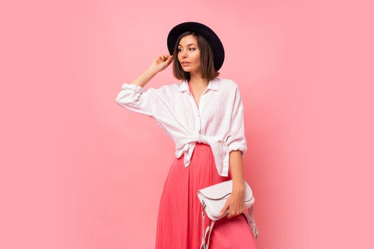
Color pairing is an art form that can transform the way we perceive everything from fashion to interior design, and even the food on our plates. Understanding how colors interact can help you create visually appealing combinations that evoke the right emotions and set the desired tone. Whether you’re dressing for a special occasion, redecorating your home, or planning a memorable event, these color pairing tips will guide you toward making confident and stylish choices.
1. Understand the Color Wheel
The color wheel is the foundation of all color theory, and mastering it is essential for effective color pairing. It consists of primary colors (red, blue, and yellow), secondary colors (green, orange, and purple), and tertiary colors (mixtures of primary and secondary colors). Complementary colors, which sit opposite each other on the wheel, create high-contrast, dynamic pairings. For example, blue and orange or red and green are classic complementary pairs that instantly catch the eye.
Analogous colors, which sit next to each other on the wheel, offer a more harmonious and subtle look. Think of a sunset with shades of yellow, orange, and red. Triadic colors, which form a triangle on the wheel, provide a balanced yet vibrant combination. A triadic scheme might include purple, orange, and green.
2. Consider the Mood You Want to Create
Colors have the power to influence emotions and set the tone for any space or occasion. Warm colors like red, orange, and yellow evoke energy, warmth, and excitement, making them ideal for lively gatherings or bold fashion statements. Cool colors like blue, green, and purple create a calming, serene atmosphere, perfect for bedrooms or relaxing environments.
For a sophisticated and timeless look, consider pairing neutral colors like beige, gray, or white with a single bold accent color. For example, a gray suit with a vibrant red tie or a white living room with a navy blue accent wall can create a polished and elegant aesthetic.
3. Play with Tones and Shades
Pairing colors isn’t just about matching hues; it’s also about exploring different tones and shades. A monochromatic color scheme, which uses variations of a single color, can be incredibly striking. For instance, pairing a deep emerald green with a soft mint creates a cohesive yet visually interesting look.
Experiment with light and dark contrasts to add depth and dimension. A pale pink paired with a rich burgundy or a light blue with a deep navy can create a sophisticated and layered effect. Don’t be afraid to mix pastels with bold shades for a modern and playful twist.
4. Use the 60-30-10 Rule
The 60-30-10 rule is a tried-and-true principle for creating balanced color schemes. In this formula, 60% of the space or outfit is dominated by a primary color, 30% by a secondary color, and 10% by an accent color. This approach ensures that your color pairing feels cohesive without being overwhelming.
For example, in a living room, 60% might be a neutral beige for the walls and furniture, 30% a soft blue for curtains and cushions, and 10% a bright yellow for decorative accents like throw pillows or artwork. In an outfit, you might wear a black dress (60%), a gray blazer (30%), and a red handbag (10%).
5. Draw Inspiration from Nature
Nature is one of the best sources of inspiration for color pairing. The natural world is full of harmonious combinations that can be easily translated into your wardrobe or home decor. Consider the calming blues and greens of an ocean scene, the warm earth tones of a forest, or the vibrant hues of a sunset.
For example, a coastal-inspired color palette might include shades of white, blue, and sandy beige, while an autumnal theme could feature deep oranges, browns, and golds. These natural pairings are inherently balanced and pleasing to the eye.
6. Test Before Committing
Before finalizing a color pairing, it’s important to test it in the context where it will be used. For fashion, lay out your outfit and see how the colors look together in natural light. For interior design, use fabric swatches, paint samples, or digital tools to visualize how the colors will appear in your space.
Remember that lighting can significantly affect how colors are perceived. A color that looks vibrant in daylight might appear muted under artificial light. Testing ensures that your chosen pairings work well in the intended environment.
7. Break the Rules (When It Works)
While guidelines like the color wheel and the 60-30-10 rule are helpful, don’t be afraid to break them when inspiration strikes. Sometimes, unconventional pairings can create the most memorable and unique looks. For example, pairing mustard yellow with lavender or coral with forest green can result in unexpected and stunning combinations.
The key is to trust your instincts and experiment. If it feels right and makes you happy, it’s likely a great choice. After all, personal style and creativity are about expressing yourself, not adhering strictly to rules.
Final Thoughts
Mastering color pairing takes practice, but with these tips, you’ll be well on your way to creating beautiful and impactful combinations. Whether you’re dressing up, redecorating, or planning an event, understanding how colors work together will help you achieve the look you desire. So go ahead, experiment with confidence, and let your creativity shine through!